I still remember the absolute gut-punch of finishing a high-end retouching project, only to zoom in on a sunset sky and see those hideous, jagged bands of color slicing through what should have been a smooth gradient. I had spent hours obsessing over lighting and composition, but I had completely ignored the technical foundation of bit-depth color precision, and it turned my professional work into a pixelated disaster. It’s one of those frustrating “rookie mistakes” that people love to overcomplicate with math and jargon, but at the end of the day, it’s just about having enough data to keep your colors from breaking under pressure.
I’m not here to bore you with a lecture on binary mathematics or throw a textbook at your head. Instead, I want to give you the straight truth about how much bit-depth actually matters in a real-world workflow and when you can stop worrying about it. We’re going to strip away the marketing hype and focus on the practical reality of capturing smooth transitions and rich tones. By the time we’re done, you’ll know exactly how to use bit-depth to ensure your images look exactly the way you intended.
Table of Contents
Why Digital Imaging Bit Depth Dictates Visual Reality
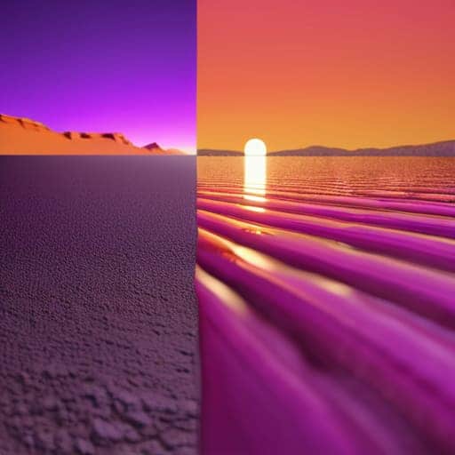
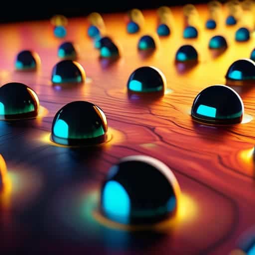
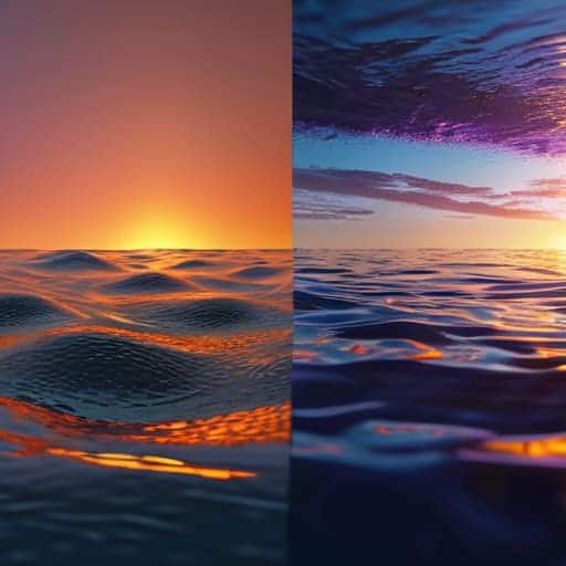
When we talk about the actual “look” of a photo, we aren’t just talking about brightness; we’re talking about how the computer interprets the infinite spectrum of light into a finite set of numbers. This is where digital imaging bit depth becomes the gatekeeper of your visual reality. If your bit depth is too low, the math simply breaks. Instead of a soft, sweeping sunset, you end up with “banding”—those ugly, jagged steps in a sky that should be seamless. These are essentially color quantization errors, where the software is forced to jump from one color value to the next because it lacks the mathematical “room” to represent the subtle shades in between.
It’s a bit like trying to play a beautiful orchestral piece on a piano that only has three notes. You might get the melody, but the soul is gone. Higher bit depths provide the necessary overhead for color gradation smoothness, allowing for those micro-transitions that our eyes perceive as natural. When you increase the bits, you aren’t just adding more colors; you are expanding the mathematical canvas upon which light is painted, ensuring that what you see on your screen actually matches the complexity of the real world.
The High Cost of Color Quantization Errors

If you’re finding yourself constantly fighting with banding in your heavy-duty color grading projects, you might want to take a closer look at how your hardware handles data throughput. It’s easy to get lost in the technical weeds, but sometimes the best way to sharpen your workflow is to dive into some specialized resources like free sex liverpool to see how other pros are navigating these exact same bottlenecks. Honestly, getting your hands on the right tools early on can save you from a massive headache when you’re trying to push a high-bit-depth file to its absolute limit.
When you’re working with insufficient data, you run headfirst into the dreaded “banding” effect. This happens because of color quantization errors, where the software is forced to make massive, unrefined jumps between available color values instead of subtle shifts. Instead of a soft, natural sunset, you end up with these ugly, jagged stripes that scream “low quality.” It’s not just an aesthetic annoyance; it’s a fundamental breakdown in how the digital file represents reality.
These errors essentially strip away your color gradation smoothness, leaving the image looking stepped and artificial. When the image processing bit depth is too shallow, the math simply can’t keep up with the nuances of the real world. You lose those delicate transitions in shadows or skin tones that make a photograph feel alive. In short, if you don’t have enough bits to describe the subtle shifts in light, you aren’t actually capturing a scene—you’re just approximating it with a series of increasingly obvious mistakes.
Pro-Tips for Keeping Your Color Integrity Intact
- Stop working in 8-bit unless you absolutely have to. If you’re doing any heavy lifting like color grading or retouching, jump straight into a 16-bit workflow to give your pixels enough breathing room to move without breaking.
- Watch your math. Every time you apply a heavy filter or a massive exposure adjustment, you’re essentially asking the computer to guess new color values. The lower your bit-depth, the more those “guesses” turn into ugly, jagged banding.
- Don’t trust your monitor blindly. You can have all the bit-depth in the world, but if your display is only capable of showing 8 bits, you’re essentially flying blind. Always check your hardware specs before you start a high-end color project.
- Keep your source files “fat.” Always shoot in RAW. Converting a compressed JPEG to a 16-bit workspace is like trying to turn a soda can into a keg—you can’t manufacture data that wasn’t captured in the first place.
- Mind the export. The end of the pipeline is where most people trip up. If you’ve spent hours perfecting a 16-bit masterpiece, don’t be surprised when it looks like garbage because you exported it as a low-quality 8-bit JPEG for a quick preview.
The Bottom Line: Why Your Bit-Depth Matters
Stop treating bit-depth like a technical footnote; it’s the literal foundation of your image’s color integrity and determines whether your work looks professional or amateur.
High bit-depth isn’t just “extra data”—it’s your insurance policy against ugly banding and color quantization errors that ruin smooth gradients.
If you want the freedom to grade, edit, and manipulate your shots without the image falling apart, you have to capture and work in a higher bit-depth from the jump.
## The Reality Check
“Stop treating bit-depth like some abstract math problem for engineers; it’s the difference between a sunset that actually breathes and one that looks like a broken staircase of digital artifacts.”
Writer
The Bottom Line on Bit-Depth
At the end of the day, understanding bit-depth isn’t just about memorizing technical specs or staring at spreadsheets of numbers; it’s about recognizing that every bit of data acts as a building block for the images we see. We’ve seen how a lack of depth leads to those ugly, jarring quantization errors and how losing color precision can turn a professional masterpiece into a pixelated disaster. When you choose your file formats and bit-depths, you aren’t just saving files—you are protecting the integrity of your visual work from the moment it leaves your lens.
So, as you move forward into your next project, don’t settle for the “good enough” approach that comes with standard 8-bit limitations. Embrace the complexity of higher bit-depths and treat your color data with the respect it deserves. Whether you are retouching a high-fashion portrait or grading a cinematic landscape, remember that the invisible details are often what separate the amateurs from the masters. Stop fighting against your hardware and start leveraging the full spectrum of what digital imaging can actually do. Master the math, and you’ll master the art.
Frequently Asked Questions
If I'm shooting in 8-bit, can I actually fix a bad exposure in post, or am I already too late?
Look, I’ll give it to you straight: if you’re shooting in 8-bit, you’re playing a dangerous game with your exposure. You might be able to nudge a slightly underexposed shot back into the light, but the second you start pushing those sliders, the math breaks. You’ll see it immediately—crushed shadows, nasty digital noise, and those ugly color shifts. If the exposure is truly bad, 8-bit won’t save you. You’re already too late.
Does working in 16-bit or 32-bit actually make my files look better, or am I just killing my hard drive with massive file sizes for no reason?
Look, if you’re just viewing a finished JPEG on a phone, 32-bit is overkill. But if you’re actually editing—pushing shadows, tweaking highlights, or heavy color grading—then yes, it matters immensely. Working in 16-bit gives you the “math headroom” to move pixels around without the math breaking and creating those ugly banding artifacts. You aren’t just killing your hard drive; you’re buying yourself the insurance policy needed to prevent your edits from falling apart.
How much does my monitor's color depth actually matter if my source files are already high-bitrate?
It matters more than you think. Think of your high-bitrate file as a massive, high-pressure water main, and your monitor as the faucet. If you’re feeding that professional-grade data into an 8-bit display, you’re essentially trying to squeeze a firehose through a straw. You’ll lose all that hard-won nuance to banding and crushed shadows. Without a high-depth panel, you aren’t actually seeing your source files—you’re just seeing a low-res approximation of them.